Adding dark mode to your expo app
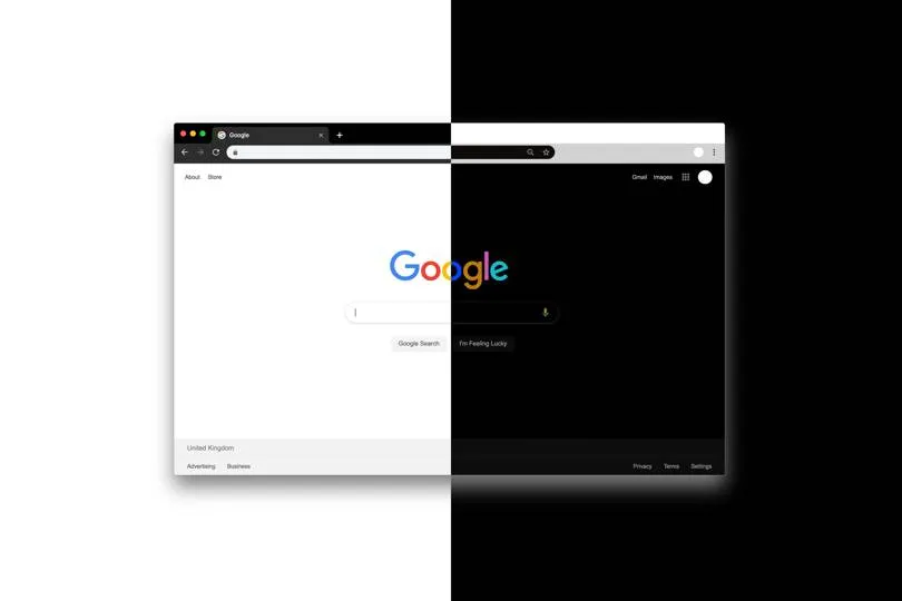
Darkmode is a new standard design in phone interfaces from the last years, basically beacuse of the benefits for your eyes when you are in the dark with your phone close to your face instead of going to sleep. So in today's post let implement it in the easiest way possible.
expo
From a couple of version ago iOS and Android allow to get the system theme for changing interface elements, basically colors.
In today's post we are going to learn how to get the selected user theme and show them an interface "accordingly".
Finally let's implement how to change it manually from the settings.
Initial setting
Install the neccessary package by executing:
yarn add react-native-appearance
Now we add a new directory within the project called "theme" with two new files:
- index.js
- colors.js
In the first one we are going to create all the logic to obtain the theme is selected by our user and in the second file we will add our color system.
.
├── src
│   ├── actions
│   ├── atoms
│   ├── components
│   ├── navigation
│   ├── scenes
│   ├── services
│   ├── state
│   ├── theme
│   │   ├── colors.js
│   │   └── index.js
│   └── utils
└── App.js
Getting the system theme
Let's create a new context that allow us access to the system theme of the users from every part of the app, for this we add the following to src/theme/index.js.
import React, { useState, useEffect } from 'react';
import { useColorScheme } from 'react-native-appearance';
import { lightColors, darkColors } from './colors';

export const ThemeContext = React.createContext({
    isDark: false,
    colors: lightColors,
    setScheme: () => { },
});
After coding the neccesary imports we have create the basis of our context with the following keys:
- isDark : a flag that indicates if we are using the dark mode,
- colors : an object with the color system,
- setScheme : a function to dynamically change the theme of the app.
After that, we create a provider to acces to the color system from every part of our app. We do that by configuring the keys of our context.
With the useColorScheme function we obtain the system preferred theme.
export const ThemeProvider = (props) => {
    // Getting the device color theme
    const colorScheme = useColorScheme(); // Can be dark | light | no-preference
};
After that we set up the isDark flag for knowing the selected theme.
const [isDark, setIsDark] = useState(colorScheme === "dark");
We add the function to change the theme manually.
useEffect(() => {
    setIsDark(colorScheme === "dark");
}, [colorScheme]);
And finally we have to set up the initial values for our provider.
const defaultTheme = {
    isDark,
    // Chaning color schemes according to theme
    colors: isDark ? darkColors : lightColors,
    // Overrides the isDark value will cause re-render inside the context.
    setScheme: (scheme) => setIsDark(scheme === "dark"),
};
And we return the provider.
return (
    <ThemeContext.Provider value={defaultTheme}>
        {props.children}
    </ThemeContext.Provider>
);
The file src/theme/index.js should look like this:
import React, { useState, useEffect} from 'react';
import { useColorScheme } from 'react-native-appearance';
import { lightColors, darkColors } from './colors';

export const ThemeContext = React.createContext({
    isDark: false,
    colors: lightColors,
    setScheme: () => {},
});

export const ThemeProvider = (props) => {
    // Getting the device color theme, this will also work with react-native-web
    const colorScheme = useColorScheme(); // Can be dark | light | no-preference

    /*
    * To enable changing the app theme dynamicly in the app (run-time)
    * we're gonna use useState so we can override the default device theme
    */
    const [isDark, setIsDark] = React.useState(colorScheme === "dark");

    // Listening to changes of device appearance while in run-time
    React.useEffect(() => {
        setIsDark(colorScheme === "dark");
    }, [colorScheme]);

    const defaultTheme = {
        isDark,
        // Chaning color schemes according to theme
        colors: isDark ? darkColors : lightColors,
        // Overrides the isDark value will cause re-render inside the context.
        setScheme: (scheme) => setIsDark(scheme === "dark"),
    };

  return (
        <ThemeContext.Provider value={defaultTheme}>
            {props.children}
        </ThemeContext.Provider>
    );
};

// Custom hook to get the theme object returns {isDark, colors, setScheme}
export const useTheme = () => React.useContext(ThemeContext);
Adding our color system
Now we have to create the color object that are going to be used in the respective themes, so lets add to src/theme/colors the following object:
// Light theme colors
export const lightColors = {
    background: 'white',
    secondaryBackground: '#f2f2f2',
    text: 'black',
    icons: '#e68a00',
    button: 'black',
    buttonText: '#e68a00'
};

// Dark theme colors
export const darkColors = {
    background: 'black',
    secondaryBackground: '#1e1e1e',
    text: '#FFFFFF',
    icons: 'orange',
    button: 'orange',
    buttonText: 'black'
};
We declare the following keys: - background : principal color of our screen background. - secondaryBackground : color that is going to be used in seconday components of the interface sus as navigation bar or information cards. - text : color of the text - icons : principal color for our icons - button : color is going to be used in the app buttons - buttonText : text color of the buttons
As you can see it is not a proffesional color system, at the very end, I am a programmer.
Adding the color provider to the app
Open src/App to add the provider we have just built
export default function App() {

  return (
    <Provider store={Store}>
      <AppearanceProvider>
        <ThemeProvider>
          <StatefullApp />
        </ThemeProvider>
      </AppearanceProvider>
    </Provider>
  );
}
And remember, you always have to add the imports:
import { AppearanceProvider } from 'react-native-appearance';
import { ThemeProvider } from '@theme';
The AppearanceProvider provider around our's it's neccesary in order to use the useColorScheme hook.
Modyfying our interface
First of all let's change our navigator colors, if you dont know how to set up the navigators check out previous post
Open src/navigation/TabNavigator.js and add the following import:
import { useTheme } from '@theme';
Now inside the "TabBar" and TabNavigator we access to the colors by using the hook:
const { colors } = useTheme();
And we change the backgroundColor of the style prop:
backgroundColor: colors.secondaryBackground
Remember also change the icon colors:
{label === 'Home' && <Ionicons name="home" size={24} color={colors.icons} />}
{label === 'Search' && <Entypo name="magnifying-glass" size={24} color={colors.icons} />}
{label === 'Profile' && <FontAwesome name="user" size={24} color={colors.icons} />}
Using the same logic we can change the rest of the elements of our interface. For example the StackNavigator component will look like this:
<Stack.Navigator
    initialRouteName={'Tab'}
    mode={'card'}
    screenOptions={navigatorOptions}
>
    <Stack.Screen
        name='Tab'
        component={TabNavigator}
        options={({ route }) => ({
            headerTitle: getHeaderTitle(route),
            headerTitleAlign: 'center',
            headerStyle: {
                backgroundColor: colors.secondaryBackground
            }
            headerTintColor: colors.text
        })}
    />
    <Stack.Screen
        name='Details'
        component={DetailsScreen}
        options={{
            headerTitleAlign: 'center',
            headerStyle: {
                backgroundColor: colors.secondaryBackground
            }
            headerTintColor: colors.text
        }}
    />
</Stack.Navigator>
One Last use example about updating the colors of Card.js
import React from 'react';
import { TouchableOpacity, Text, StyleSheet } from 'react-native';
import { useTheme } from '@theme';

export const Card = ({ title, body, style, onPress }) => {

    const { colors } = useTheme();

    return (
        <TouchableOpacity style={{ ...style, ...styles.container, backgroundColor: colors.secondaryBackground }} onPress={onPress}>
            <Text style={{...styles.title, color: colors.text}}>{title}</Text>
            <Text style={{...styles.body, color: colors.text}}>{body}</Text>
        </TouchableOpacity>
    )
}

const styles = StyleSheet.create({
    container: {
        padding: 20,
        flexGrow: 1,
    },
    title: {
        fontWeight: 'bold',
        fontSize: 24
    },
    body: {
        fontWeight: 'normal',
        fontSize: 16
    }
});
Changing dynamically the theme
Let's create a button to allow changing dynamically the theme.
For this we create a new button within the Profile.js screen and it's respective function.
<Button
    style={{ marginTop: 40, height: 40, width: 160, backgroundColor: colors.button, borderRadius: 8 }}
    textStyle={{ color: colors.buttonText }}
    text='Change theme mode'
    onPress={() => changeTheme()}
/>

const changeTheme = () => {
    if(isDark){
        setScheme('light');
    } else {
        setScheme('dark');
    }
}
Our screen should have this appareance:
import React, { useState } from 'react';
import { useSelector, useDispatch } from 'react-redux';
import { SafeAreaView, StyleSheet, Text, TextInput, View } from 'react-native';
import { Button } from '@atoms';
import { updateUsername } from '@actions/users';
import { useTheme } from '@theme';


export const ProfileScreen = ({ }) => {
    const dispatch = useDispatch();
    const { colors, setScheme, isDark } = useTheme();

    const user = useSelector( state => state.user);
    const [newUsername, setNewUsername] = useState('');

    const saveUsername = () => {
        // in case the username hasnt been updated
        if(newUsername === '') return;

        // update the username
        dispatch( updateUsername(newUsername));

        // clean the newUsername variable
        setNewUsername('');
    }

    const changeTheme = () => {
        if(isDark){
            setScheme('light');
        } else {
            setScheme('dark');
        }
    }

    return (
        <SafeAreaView style={{...styles.container, backgroundColor: colors.background }}>
            <Text style={{color: colors.text}}>Welcome {user.username}</Text>

            <View style={{marginTop: 40}}>
                <TextInput
                    style={{ height: 40, borderColor: colors.button, borderWidth: 1, borderRadius: 12, padding: 8, color: colors.text}}
                    onChangeText={text => setNewUsername(text)}
                    value={newUsername}
                    placeholder='New Username'
                    placeholderTextColor={colors.text}
                />
                <Button
                    style={{height: 40, width: 160, backgroundColor: colors.button, borderRadius: 8, marginTop: 10}}
                    textStyle={{ color: colors.buttonText }}
                    text='Save'
                    onPress={ () => saveUsername()}
                />
            </View>

            <Button
                style={{marginTop: 40, height: 40, width: 160, backgroundColor: colors.button, borderRadius: 8 }}
                textStyle={{ color: colors.buttonText }}
                text='Change theme mode'
                onPress={() => changeTheme()}
            />

        </SafeAreaView>
    )
}

const styles = StyleSheet.create({
    container: {
        flex: 1,
        alignItems: 'center',
        justifyContent: 'center',
    },
});
Saving up the selected theme in redux
Finally we are going to save the theme selected by the user in our app state.
If the user changes the theme manually we don't want to get the system theme the next time the app is fired.
For this we add to our action repository a new fille called settings.js that is going to keep all the user settings.
export const UPDATE_THEME = 'UPDATE_THEME';
export const updateTheme = (theme) => ({ type: UPDATE_THEME, theme });
And add a new settings reductor to reducers.js.
const settings = (settings = { theme: 'default'}, action) => {
    switch (action.type){
        case UPDATE_THEME:
            return { ...settings, theme: action.theme }
        default:
            return settings;
    }
}
Important! Eemember adding it to the combineReducers function:
export default combineReducers({ user, posts, settings });
Now when we obtain the system in our provider we check if the user has saved previously another one with the following:
// Getting the state color scheme
const savedScheme = useSelector( state => state.settings.theme) || 'default';
Updating the isDark flag accordingly:
/*
* To enable changing the app theme dynamicly in the app (run-time)
* we're gonna use useState so we can override the default device theme
*/
const [isDark, setIsDark] = savedScheme === 'default' ?  useState(colorScheme === "dark") : useState(savedScheme === 'dark');
Finally we update the state when the theme is manually changed.
const changeTheme = () => {
    if(isDark){
        setScheme('light');
        dispatch(updateTheme('light'));
    } else {
        setScheme('dark');
        dispatch(updateTheme('dark'));
    }
}
So our color system and themes are set up. Hope it has been helpful and see you on the next one!
