First steps in building an expo app and good practices

The scalability of a project such as an app is a complex task because it is impossible to know all the functionality you'll end up implementing from the beginning of development. Even if you have a plan for what you want to implement, new ideas almost always arise. In today's post we'll talk about a couple of best practices to minimize scalability issues when your Expo project starts growing.
expo
If you just created your first app and don't know how to organize the project, stay tuned as we'll be going over some tips that would have been useful to me when I started. If I'd known these when I started, I could have avoided rewriting a large part of an app when the code grew, since I hadn't done a good job at organizing the code.
Organization
We'll split the project in the following way
.
├── src
│   ├── navigation
│   ├── scenes
│   ├── components
│   │   ├── lib
│   │   └── atoms
└── App.js
The idea is to have a main navigation controller with 3 or 4 screens, which we'll refer to as scenes. Each scene will have several big components such as a carousel (like Instagram's stories) which we'll keep in our lib folder. We we'll try to code general, reusable components as much as posible. Although this last point can get a bit tricky, it will save you a lot of work in the long run.
These big components are themselves made up of smaller components, which we'll call atoms. Examples of these are a text input field or a button. They are repeated everywhere in our application, so it is crucial they are reusable.eutilizables.
To organize these three items we'll create the src folder in the root of our project and a folder for each of them inside src:
- navigation
- scenes
- components
- atoms
- lib
Generalization is key
Let's start with the most simple component, a button.
Create a file called index.js inside the src/components/atoms folder. We'll export our reusable components from that file. Create the file Button.js inside that same folder so that the directory structure looks like this:
.
├── src
│   ├── navigation
│   ├── scenes
│   └── components
│       ├── lib
│       └── atoms
│           ├── index.js
│           └── Button.js
└── App.js
Import the required dependencies in Button.js:
import React from 'react';
import { TouchableOpacity, Text } from 'react-native';
We'll use the TouchableOpacity component to create our button. To make it general, we'll provide style and text arguments to our component..
export const Button = ({text, style}) => {

    return(
        <TouchableOpacity style={style}>
            <Text>{text}</Text>
        </TouchableOpacity>
    )
}
To make it available for the rest of our app, we export it from atoms/index.js:
export { Button } from './Button';
Now we can use if from our App.js file after importing it
import { Button } from './src/components/atoms';
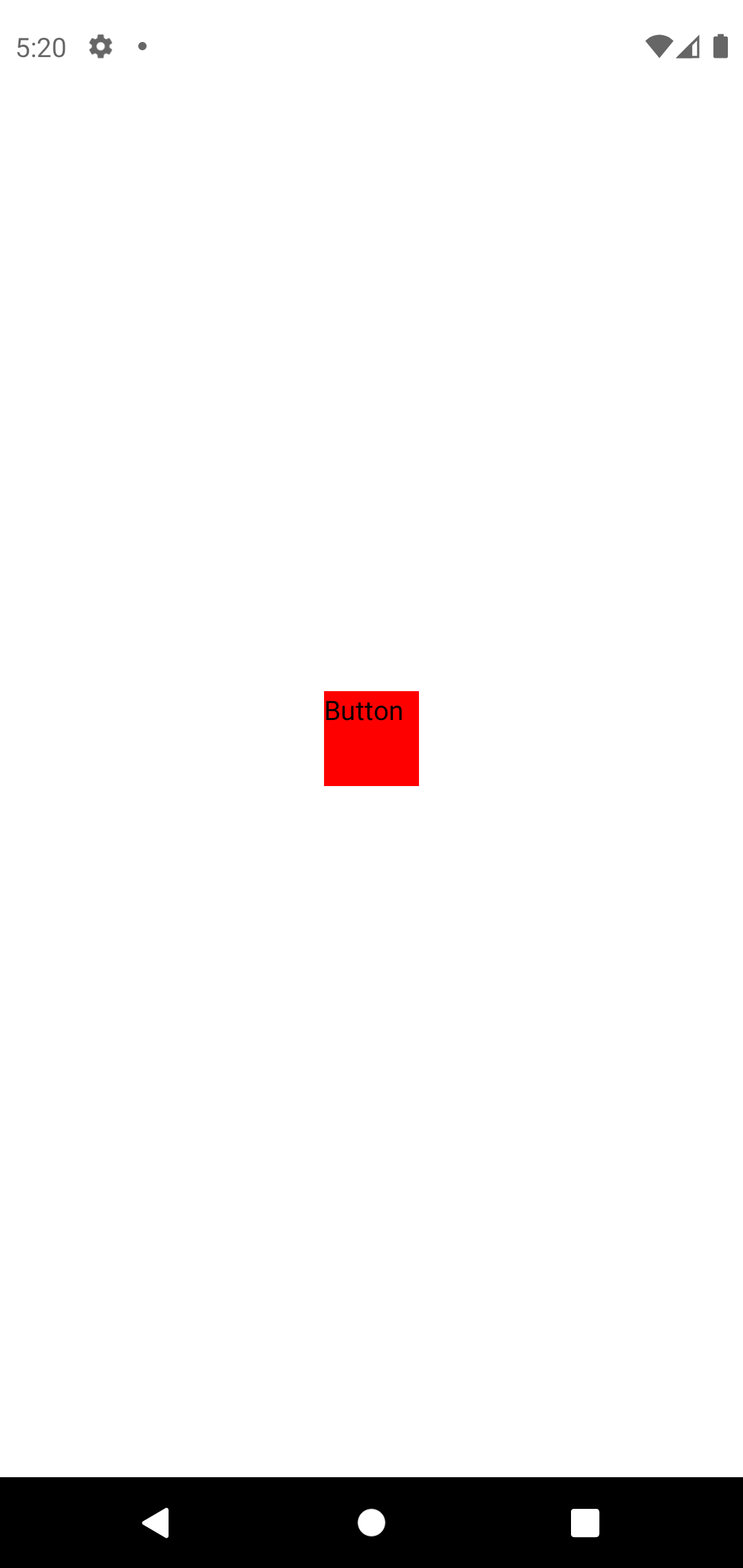
We can instantiate a simple square button with a red background and with the text Button
export default function App() {
  return (
    <View style={styles.container}>
      <StatusBar style="auto" />
      <Button
        style={{ width: 50, height: 50, backgroundColor: 'red' }}
        text='Button'
      />
    </View>
  );
}
Now, if we need a rectanuglar button, instead of having to replicate the code in Button.js every time we need to change the style, we can just pass a different value for the style prop. This makes the code much more compact and easier to understand.
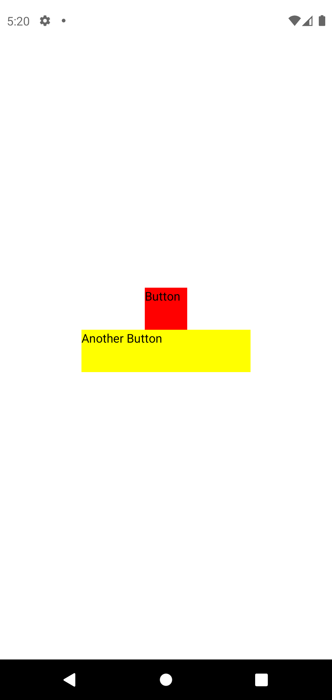
export default function App() {
  return (
    <View style={styles.container}>
      <StatusBar style="auto" />
      <Button
        style={{ width: 50, height: 50, backgroundColor: 'red' }}
        text='Button'
      />
      <Button
        style={{ width: 200, height: 50, backgroundColor: 'yellow' }}
        text='Another Button'
      />
    </View>
  );
}
A scene can end up having between 500 and 800 lines of code, so legibility is appreciated.
General changes in a single style
Let's imagine that we now want the text to always be placed at the center of the button. It's as easy as adding that style to the Button.js file directly. This will take effect in every Button in your application, and you won't have to go over every single one of them changing the style.
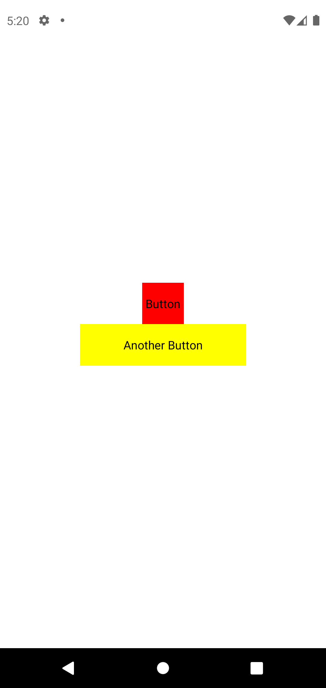
export const Button = ({text, style}) => {

    return(
        <TouchableOpacity style={{ ...style, ...styles.container }}>
            <Text>{text}</Text>
        </TouchableOpacity>
    )
}

const styles = StyleSheet.create({
    container: {
        alignItems: 'center',
        justifyContent: 'center',
    },
});
This may look like something trivial now, since we only have two buttons. But think if about all the buttons that are present in an app and you won't find having to go over every single one of them that funny.
Configuring Babel
We won't always be writting a file at the root of the project. As we go into deeper file routes, the import statements will have more complicated routes themselves. To save typing, we're going to use Babel to configure aliases.
Add the Babel dependencies by executing the following command in your app project's root:
yarn add babel-preset-expo babel-plugin-module-resolver --dev
Create the file babel.config.js and add:
module.exports = function(api) {
  api.cache(true);
  return {
    presets: ['babel-preset-expo'],
    "plugins": [
      [
        "module-resolver",
        {
          "root": ["./src"],
          "alias": {
            "@atoms": "./src/components/atoms",
          }
        }
      ]
    ]
  };
};
We've added the module-resolver plugin. In its configuration, we specified that the root source is ./src and that the @atoms alias maps to ./src/components/atoms.
Finally, we move the App.js file inside the src folder and we create an index.js file in the project root.
The contents of that new index.js file come from the file node_modules/expo/AppEntry.js. Copy the contents of that file inside index.js and modify the import statement of App so that if matches the following:
import registerRootComponent from 'expo/build/launch/registerRootComponent';

import App from './src/App';

registerRootComponent(App);
Open the file package.json and write index.js under the route main.
Every time we modify the babel.config.js file, it is recommended that you clear the cache. Stop execution in the terminal where you executed expo start and relaunch it with
expo start --clear
Now that the @atoms alias is configured, the import statement in our src/App.js file becomes
import { Button } from '@atoms';
Upload your project to GitHub
To finish, we'll create a GitHub repository where we'll be able to keep track of the changes we're making.
As before, it might look like it is not worth it now, but when you have a version of the app running in production, another one for testing and two or three developers contributing code at the same time you'll see how necessary it is.
Run git init in the projects root and then run git status to see the modifications you've made.
Commit your changes with
git commit -m "Some descriptive message"
It is recommended to make small commits with few changes and descriptive messages, so that you can later search through them effectively.
Open GitHub from your browser and create a new blank repository. Copy the https address from the repo and execute:
git remote add origin [Your url]
Configure origin as the remote where to push commits by default for the master branch with
git push --set-upstream origin master
By doing this, the next time it will be enough to run git push and everything will be configured.
I hope these tips were helpful, if not now, maybe in the future. See you in the next post!
