The effect of sample size on rate estimation for low-prevalence events

We look at the effect of sample size on a naive rate estimation model for a low-prevalence disease. In this context, small populations are likely to have extreme incidence rates on both ends of the spectrum. We also look at how a more elaborate model using Bayesian inference can help mitigate the effect of limited data (as in low sample size) on rate estimations for subpopulations, given the global prevalence of the event is known.
probability statistics
The idea for this post comes from chapter 2 of the book Bayesian Data Analysis by Gellman et al.
Introduction
In this post we look at kidney-cancer death rates in the United States between 1980 and 1989. Data is available per-county for each of the roughly 3000 counties in the US. If we wish to estimate the probability of death due to kidney cancer over a 10 year period, we could take a naive approach and estimate it by the raw rate over 10 years (number of kidney-cancer-related deaths per 100k inhabitants per 10 years). Given the population of the US, there are mathematical guarantees that this will indeed be a good estimate. However, if we want to have rates per-county, where the population size is sometimes as low as 1000 inhabitants, these mathematical guarantees no longer apply.
This becomes evident when looking at a map where the top 10% of counties are shaded and compare it with another where the bottom 10% are shaded. An interesting pattern emerges in the geographic location of these extreme counties: most of them are in the midwest/Great plains area. Just by looking at the first map, one might try to argue that these people have less access to care, or that the environment is more poluted there... But when confronted with the second map these arguments are all meaningless.
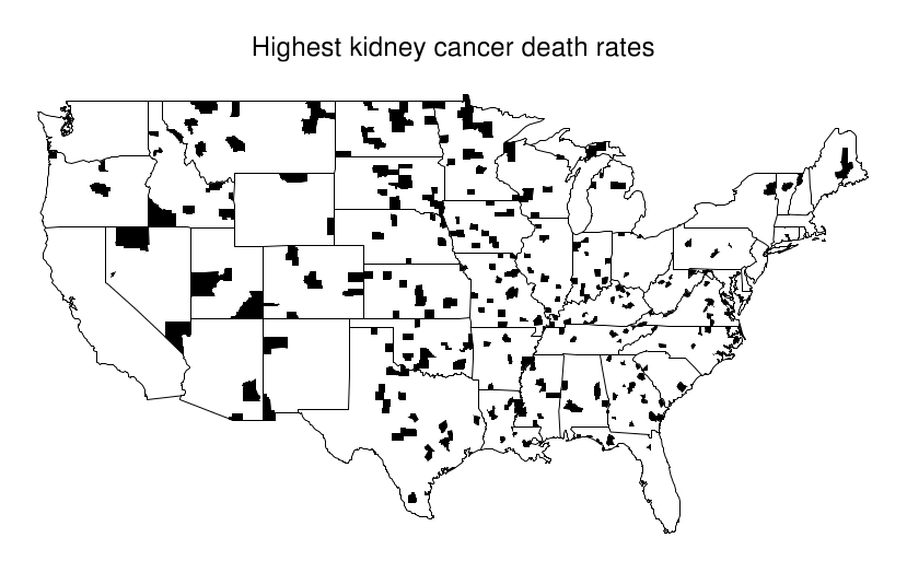
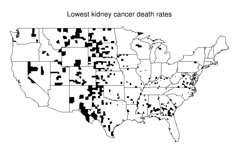
What's happening here is that these Midwestern counties share one thing in common: they all are in low population density areas. This, combined with the low overall prevalence of kidney cancer leads to extreme calculated values for the rate. Suppose the overall rate is 1 per 10k per 10 years. Then it is somewhat likely that in a small county with a population of 1000 we won't see any cases, which would directly put it at the bottom of the table with a 0% rate. In contrast, it is not unthinkable that we might see 2 cases, that would immediately put it at twice the national average, probably on the top 10%.
In the remainder of this post we explain how to use a simple Bayesian approach to mitigate the effect of population size on these estimates for the kidney-cancer related death rate.
Data
Data comes from the supplementary material of the Book. We are presented with a list of counties, the population in them and the number of kidney-cancer related deaths over the 10-year period between 1980 and 1989. Minimal cleaning is required to load it into a Python notebook. However, we don't have much information on what each of the columns means so we use dc for death count and pop for population. For some reason the values for the population are roughly double what the population was in those years yo we adjust by adding a factor of 1/2. Also, since the data comes split in two five-year periods, we combine them by averaging the population and adding the number of deaths. This is not important for the conclusions of this article. Below is example code for how to load the data.
# import libraries and data
import pandas as pd
import numpy as np
import matplotlib.pyplot as plt
from pprint import pprint
from scipy.stats import poisson, gamma, nbinom

# helper function
def plot_dist(dist):
    '''Plots the PMF or PDF of the given distribution.'''
    m, M = dist.ppf(.001), dist.ppf(.999)
    if M-m > 1:
        x = np.arange(m, M, step=max(1, (M-m)/100), dtype=int)
    else:
        x = np.arange(m, M, step=(M-m)/100)
    try:
        plt.bar(x, dist.pmf(x))
    except AttributeError:
        plt.plot(x, dist.pdf(x))
    plt.title('mean = %.2e, var = %.2e' % (dist.mean(), dist.var()))

gd80to84 = pd.read_table('gd80to84.txt', index_col=[0,1]).dropna()
gd85to89 = pd.read_table('gd85to89.txt', index_col=[0,1]).dropna()

data = gd80to84 + gd85to89
data = data[data['pop'] > 0]
data['pop'] = data['pop'] / 4 # additional factor of 1/2 to account for the strange population numbers in the data
data['raw_rate'] = data['dc'] / (data['pop'] * 10) # divide by ten to get rate per 10 years
data = data[['raw_rate', 'dc', 'pop']]
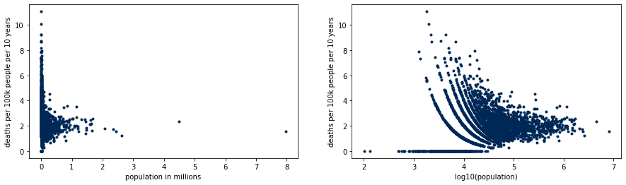
We illustrate the extreme rates on small counties with the following plot. Counties with low population have both the lowest and highest rates of the country, but densely populated counties concentrate around what will turn out to be the real rate. The patterns on the right hand side plot are due to the discrete nature of the data.
Methodology
Since we are estimating a rate, it's natural to assume that deaths are distributed according to a poisson distribution. Let $\theta$ be the underlying and unknown death rate. We choose to model the number of deaths $y$ over a ten year period in a population of $n$ with
$$y\mid \theta \sim \text{Poisson}(10 n \theta).$$
To perform Bayesian inference we need a prior distribution for the unkown rate. We use a gamma distribution for convenience, because it is conjugate to the Poisson. To follow convention of the book, we parametrize it by a shape parameter $\alpha$ and an inverse scale parameter $\beta$ so that
$$\theta \sim \text{Gamma}(\alpha, \beta).$$
We do not perform Bayesian inference on these parameters. Instead, we adjust the Gamma distribution by using the mean and standard deviation, which satisfy
$$E(\theta) = \alpha / \beta \qquad \text{var}(\theta) = \alpha / \beta^2.$$
We calculate the sample mean and variance of the raw rate $y / 10n$ and match them to $E(\theta)$ and $\text{var}(\theta)$ to obtain the parameters $\alpha = 2.58,\ \beta = 119\ 636$.
As shown in section 2.6 of the book, the posterior $\theta | y$ is again Gamma-distributed with shape $\alpha + y$ and scale $\beta + 10n$ like so
$$\theta \mid y \sim \text{Gamma}(\alpha + y,\ \beta+10n).$$
Finally, to make predictions we need to know how $y$ is distributed. This is explained in section 2.6 of the book and it turns out that under our assumptions for the model and the prior distributions $y$ has a negative binomial prior distribution like so
$$ y \sim \text{Neg-Bin}\left( \alpha, \frac{\beta}{10 n}\right).$$
We shall apply this model for each county, in which the values for the raw rate and the population are different and hence the underlying unkown rate also will be.
Using the standard scipy family of Python packages, we can express the model like this:
mu = data['raw_rate'].mean()
sigma = data['raw_rate'].std()
alpha = mu**2 / sigma**2
beta = mu / sigma**2

def model(n, theta): # likelihood, since it's a function of theta
    return poisson(10 * n * theta)

prior = gamma(a=alpha, scale=1/beta)

def posterior(y, n):
    return gamma(a=alpha+y, scale=1/(beta + 10*n))

def predictive(n):
    _beta = beta/(10*n)
    return nbinom(n=alpha, p=_beta/(_beta+1))
Results
Model evaluation for a small county
Now we apply the model to a county with a population of 1000. In such a small county, we could expect that there be 0, 1 or 2 kidney-cancer-related deaths given the small prevalence of the illness. We simulate the posterior distribution for these cases and look at the posterior mean. As we can observe, the prior distribution dominates over the data. We also look at how likely is it, a priori that the number of observer deaths is 0, 1 or 2, by using the predictive distribution.
We can see that more cases are highely unlikely by looking at the predictive distribution, which yields probabilities less than 0.005 for $y > 2$.
n_small = 1_000
small_cty = pd.DataFrame(index=pd.RangeIndex(start=0, stop=3, step=1, name='y'))
small_cty['raw_rate'] = [y / (n_small*10) for y in small_cty.index]
small_cty['posterior_mean'] = [posterior(y, n_small).mean() for y in small_cty.index]
small_cty['predictive'] = [predictive(n_small).pmf(y) for y in small_cty.index]
small_cty
| y | raw_rate | posterior_mean | predictive |
|---|---|---|---|
| 0 | 0.0000 | 0.000020 | 0.812906 |
| 1 | 0.0001 | 0.000028 | 0.161804 |
| 2 | 0.0002 | 0.000035 | 0.022344 |
Model evaluation for a large county
If we consider a county with a population of 1 million, we can see that the data dominate over the prior distribution. By looking at the predictive distribution we find that the average number of cases we can find are XXX and that the number of cases will be between X and Y 50% of the time (50% most likely values for number of deaths). If we look at the Bayesianly estimated death rates for those values, we see that the influence of the data is much larger, in fact, the posterior mean perfectly matches the raw rate.
n_large = 1_000_000
y_bar = round(predictive(n_large).mean())
y_50_lower = predictive(n_large).ppf(.25)
y_50_upper = predictive(n_large).ppf(.75)
print('predictive mean = %d, 50%% interval = [%d, %d]' % (y_bar, y_50_lower, y_50_upper))

large_cty = pd.DataFrame(index=pd.Index(data = [y_50_lower, y_bar, y_50_upper], name='y'))
large_cty['raw_rate'] = [y / (n_large*10) for y in large_cty.index]
large_cty['posterior_mean'] = [posterior(y, n_large).mean() for y in large_cty.index]
large_cty['predictive'] = [predictive(n_large).pmf(y) for y in large_cty.index]
large_cty
| y | raw_rate | posterior_mean | predictive |
|---|---|---|---|
| 116.0 | 0.000012 | 0.000012 | 0.003540 |
| 216.0 | 0.000022 | 0.000022 | 0.002856 |
| 286.0 | 0.000029 | 0.000029 | 0.001931 |
Applying the model to the data
Now we use the model to compute Bayesianly estimated death rates for every county in the dataset. We repeat the previous plots to see how the rates are much more uniformly distributed. Here, we call the mean of the posterior distribution the bayes_rate.
data['bayes_rate'] = data.apply(lambda r: posterior(r['dc'], r['pop']).mean(), axis=1)
data.head()

graph = data.copy()
graph['dr_100k'] = data['bayes_rate'] * 100_000 # multiply by 100k to get rate per 100k-people per 10-years
graph['pop_1M'] = data['pop'] / 1_000_000
graph['log10_pop'] = np.log10(data['pop'])


fig, axs = plt.subplots(1, 2)
axs[0].scatter(graph['pop_1M'], graph['dr_100k'], c='black', marker='.')
axs[0].set_ylabel('deaths per 100k people per 10 years')
axs[0].set_xlabel('population in millions')
axs[1].scatter(graph['log10_pop'], graph['dr_100k'], c='black', marker='.')
axs[1].set_ylabel('deaths per 100k people per 10 years')
axs[1].set_xlabel('log10(population)')
fig.set_figwidth(15)

Discussion
As we've seen, using a Bayesian approach leads to much more sensible results for the death rates on each county, especially for smaller counties where the objective of mitigating the effect of sample size is achieved. This model does have its shortcomings nonetheless. For instance, we could have used hiearchical modelling to estimate the parameters of the Gamma distribution, or used another prior distribution altogether. Moreover, death rates over a ten year period would normally require taking into account age to be representative of the illness under study. We left out age adjustment from this post but the data does provide age-adjusted death count.
